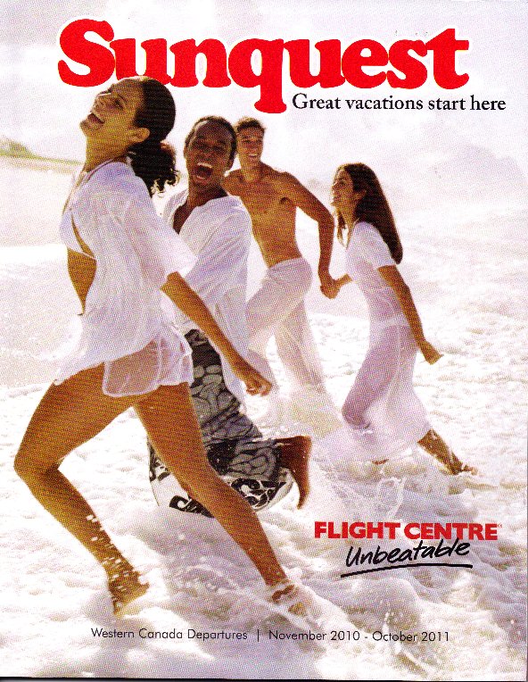
 I was walking past a local Flight Centre travel agency the other day and noticed all of the brochures stacked up by the door. We have been thinking of having a spring break holiday in the sun and the brochures enticed me into the travel agency.
I’ve written before about Painting a Vision of what a customer can do with your product or service. For a travel agency, that vision is you being on vacation somewhere other than where you are right now. In rainy Vancouver, the picture of happy people frolicking in the sun and surf is just the kind of vision that would help entice us into buying a holiday.
In the days of everything online, there is still a place for traditional marketing materials. The physical presence of the brochure in the travel agency leant credence to the idea of a holiday. The Sunquest brochure that I feature with this post is typical of holiday booklets. I think they continue to have huge impact over their online counterparts for these reasons:
- There are hundreds of photographs in the booklet. You can scan these photographs in a tiny fraction of the time that you could look at the same number online.
- You can flip through the booklet quickly, pausing at anything that catches your attention. If you know exactly where you want to go, online resources can zero in on the specific choices. If you just want a general style of holiday (sun, Europe, adventure …) a booklet focused on the style that interests you provides many more possibilities.
- Fast price comparisons. The booklet I was looking at had prices on every single page. You can quickly see the tradeoffs of different price points, in either location or quality.
- The consistent layout of the booklet makes comparisons far easier for one vacation choice to another. The entire booklet is organized by location. Each vacation choice is laid out in the same manner, using the same type fonts, colors, and keywords.
Beyond these practical features of a booklet, there is an even more important marketing reason why they work. As humans we are tactile beings. The more we can feel and touch something, the more real it seems to us. The Sunquest booklet is hefty. It feels substantial. As I write this posting, the booklet sits in my lap and I can feel its weight. The booklet is over 170 pages long. The booklet is beautifully laid out and printed on semi-gloss paper. It all adds up to creating belief that Sunquest can deliver a great vacation for our family.
And for the record, we’re going on a Sunquest vacation to Puerto Vallarta for Spring Break. Isn’t that what dreams are made of?


How interesting, and contrarian in today’s online world. Also, our present “green” tendencies make it more difficult to burn or bury a nice piece of collateral. I also have pamphlets that hang around. I hope that good hard copy does not become a lost art.
Thanks Tom.
The truth is that main stream brands still are using a lot of printed materials. Why? Because they work.
Online conversations and links seem to disappear in the ether. A physical brochure hangs around, sits on your desk, and you can show it to your spouse. This has far more impact. To keep it greener, many brands are making sure that they print on recycled paper and encourage their prospects and customers to recycle.
Pingback: Making Dreams Come True « David J Greer's Blog